

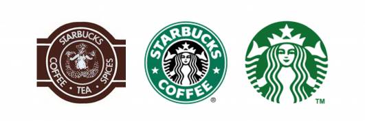
Starbucks was founded in Seattle in 1971, and although the design of their world-famous logo has changed a few times since then, the basic image has remained.
Starbucks: Success Leads to Streamlining
In 1987, the logo was 'tidied up' and and the Siren was given a more streamlined, modern appearance, although she gained a crown in the process. The more familiar wording appeared in a circular band around the image and the predominant colour became green rather than brown, with a small amount of black filling in the background behind the Siren's head.
1992, and another change saw the image of the Siren cropped, closing in on her face and upraised hands. This form of the logo lasted 19 years, when Starbucks did away with the circular band and wording, concentrating instead on an larger image of the Siren's face, upper body and hands.
The Siren herself was also slightly altered. Commenting on the dropped Starbucks wording, the spokesman added: "Our new evolution liberates the Siren from the outer ring, making her the true, welcoming face of Starbucks."
Here's a tutorial on how to make your own version of the old-style Starbucks logo using an app: